Input
Input
Input let user enter and edit text
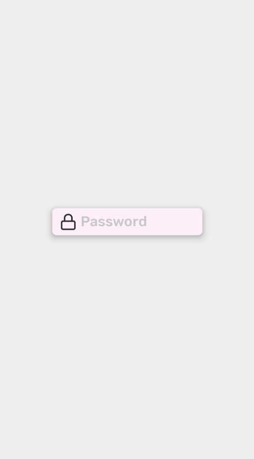
import React from 'react';
import { Container, Input } from 'react-native-simple';
import { StyleSheet } from 'react-native';
import { Feather } from '@expo/vector-icons';

export default () => {
    return (
        <Container style={styles.container}>
            <Input
                startIcon={<Feather name="lock" style={styles.icon} />}
                placeholder="Password"
                containerStyle={styles.input}
                backgroundColor="primary"
                color="primary"
                shadow="default"
            />
        </Container>
    );
};

const styles = StyleSheet.create({
    container: {
        justifyContent: 'center',
        alignItems: 'center',
    },
    input: {
        width: '60%',
    },
    icon: {
        fontSize: 25,
        color: '#2f2f2f',
        marginRight: 5,
    },
});
Props
containerStyle
Style of the Input container
| Type | Default |
|---|---|
StyleProps<ViewStyle> |
color
Color of the text
| Type | Default |
|---|---|
SimpleTextColor | 'primary' |
borderColor
If defined border of the Input will show up (default width of the border is 2)
| Type | Default |
|---|---|
SimpleBackgroundColor | undefined |
backgroundColor
Background color of the Input
| Type | Default |
|---|---|
SimpleBackgroundColor | 'transparent' |
shadow
Shadow of the Input
| Type | Default |
|---|---|
SimpleShadow |
startIcon
Component on the left side of the Input
| Type | Default |
|---|---|
ReactNode |
endIcon
Component of the right side of the Input
| Type | Default |
|---|---|
ReactNode |